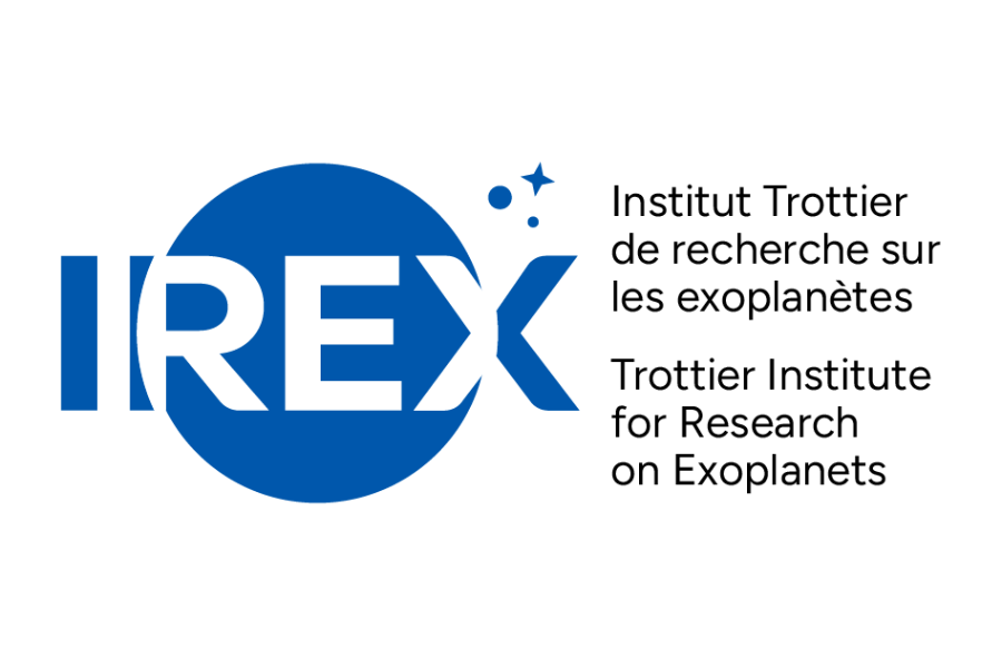
We are excited to unveil our new logo, which reflects the core mission of IREx: “Exploring new worlds in the search for life.” Designed to align aesthetically with the logos of other research centres and institutes at the Université de Montréal, such as IRIC and CÉRIUM, the logo reinforces our institute’s vision. Check out our dedicated page to explore the various versions of the new design.
The logo was developed by Université de Montréal’s Bureau des communications et des relations publiques (BCRP), in close collaboration with the IREx management team, notably Nathalie Nguyen-Quoc Ouellette, our Deputy Director. To learn more about the creative process and what inspired this new logo, we interviewed David Tousignant, graphic designer at BCRP.
IREx: What was your inspiration behind the creation of the logo?
David: The idea that most inspired me was the IREx mission, which is nothing less than to search for a habitable planet in our Universe! So I wanted to graphically represent the search for life elsewhere in the Universe. It was very exciting!
IREx: Can you explain what the logo represents?
David: First of all, we find the typography “IREx” in the foreground, in the center of the composition and in large letters. I wanted the white letters to contrast with the blue circle in the background, to give the impression that the word is moving towards us.
Behind the typography is the large blue circle, which has a double meaning. Firstly, it represents a habitable planet, but it also evokes a [telescope] lens, revealing a discovery. The two smaller circles and the star in the background represent our vast Universe and its possibilities.
IREx: Were there any challenges in creating the logo?
David: The main challenge was the representation of the habitable planet. We don’t know what such a planet would look like! Several attempts were made, but we weren’t satisfied: there were too many or too few continents, not enough clouds, too many clouds, and so on. Finally, we went back to simplicity: a blue circle!
On the other hand, getting to the final version of a logo is always difficult. When there were several people involved in the process, so getting the visual approved was a challenge. It’s only natural! Each person interprets the visual in his or her own way, and many criticisms and new ideas arise, which can be excellent! Then it’s a matter of making choices, and sometimes abandoning ideas that were dear to us and going back to the drawing board!
In the end, the important thing is to come up with a visual that brings people together, gives them a sense of belonging, and accurately communicates what IREx is and what its mission is: to find a new “Blue Planet”.
We have chosen to adopt a more grammatically correct form of the institute’s acronym. Instead of the original typography “iREx,” which was associated with the previous logo, we will now use “IREx” moving forward.
You must be logged in to post a comment.